Why was a new profile important?
It can certainly be argued that it's the ego, design agency "trap" of wanting to redesign and rebrand several times a year, but we came to the conclusion that we believed there were actually some logical reasons for this too.
It was by no means bad if we look only at the results, there were still between 20 and 30 inquiries per month with potential projects, but the experience is that there is even more to gain.
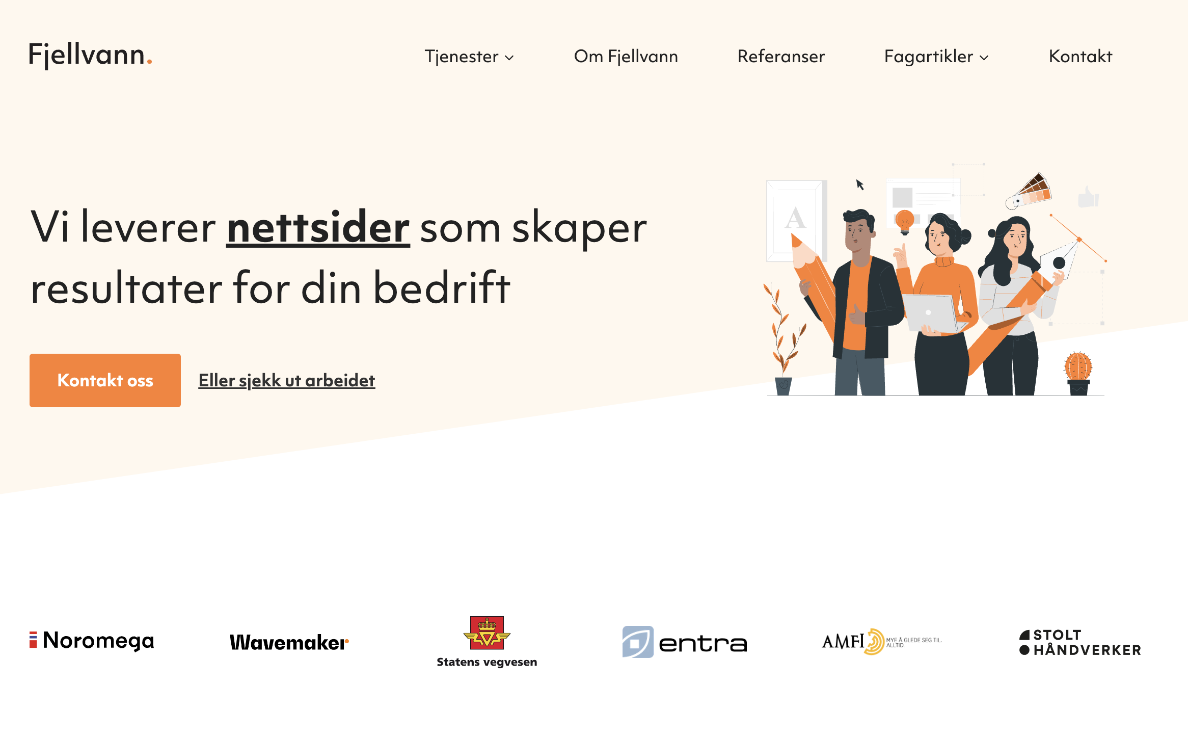
- The old profile was generic and didn't stand out in the crowd (there are plenty of agencies out there that look almost identical).
- It could be perceived as a bit "childish" and it was time to step out of the nursery visually, considering the deliveries we were making.
- The content on the site was also outdated, and the motivation was very low to do a good job of showing new projects, for example. We were so "bad" that the latest project posted was 4 years old.
- Present our range of services. Although the focus is on websites and we will continue to specialize in this area, there is so much more to it than "just" web design and development.

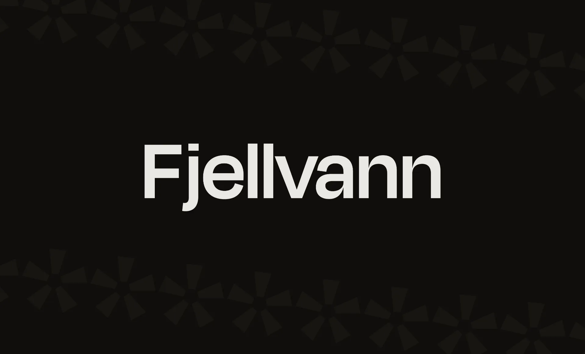
Highlights of the new profile
It shouldn't be a ridiculously long abstract explanation of why the choices were made, but a short summary that doesn't require a master's degree in design or communication.
- We wanted a visual style that was toned down, grown-up, but still with a hint of playfulness.
- It was to be a simple color palette that could be used in both dark and light versions.
- It had to be a font that was slightly unique, but not too extreme.
- We wanted a profile where the design doesn't carry the whole thing, but that it's the message and communication that takes up space.
